Accountants are part of every organization, and they are important because they manage the monetary aspects of the business. They must be able to work with different types of people and across various departments. Therefore, they must use various tools, one of which is MS Excel. In order to use it productively, they must have the necessary skills and know when to apply … [Read more...]
How to Create Combination Charts in Excel
Most Excel users know how to create either a bar chart or a line chart to visually show a set of data. One way to really step up your game and graphically show multiple relationships across two or more sets of data is to use a combination chart. This powerful function will allow you to combine a bar chart and a line graph and add a Y-axis (vertical line) to express broader … [Read more...]
Dynamic Chart Labels
Using charts in Excel can be a very powerful tool when used correctly. They can help to quickly visualize trends, and analyze results. The charts, however are useless if the person who is looking at them can't tell what the data is that they are trying to analyze. Excel helps the user by inserting labels in key points to help the user identify what they are looking at. If … [Read more...]
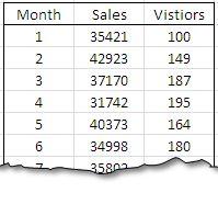
Using Charts in Excel
There are several different types of charts found in Excel. All of which are used to display information in a way that makes it easier to interpret data. Column charts are best suited to compare distinct object levels in a vertical format. Line charts compare trends over even time periods, but are not necessarily used to show totals. Pie charts show the relative size of … [Read more...]