Excel Sparklines are a neat feature that was introduced back in Excel’s 2010 version. Excel Sparklines gives you a small chart that represents a set of data that can be inserted in a cell for a quick graphical representation of the data. While a Sparkline can be placed anywhere in a spreadsheet it tends to have the most impact if it is placed closer to the data it represents.
What Are Excel Sparklines?
You might be thinking to yourself, why not just use a regular chart? While you certainly still can use a chart to display the same data, sometimes it is a bit overkill to have a large chart, or even several large charts, next to your data.
Sparklines are also not objects like a chart is. They appear in the background of a cell so you can type text over it if you wanted to.
In addition to the default line graph, Sparklines also can be displayed as columns or in a win/loss format.
Why Use Sparklines?
When you have a set of data in a table, it is useful for organization purposes, but data in that format makes it hard to find patterns or trends with a quick glance. Sparklines provides a nice easy way to get a high-level overview of the data without spending much time analyzing the numbers behind it.
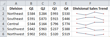
Take the data in the image below that shows quarterly divisional sales for an imaginary company. By itself, it might be hard to visualize how well any one division did in the second quarter. With the Sparklines in column F you can easily see which division did well and which did poorly compared to the other quarters.
How to Create a Sparkline in Excel
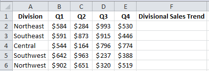
Creating a Sparkline is really simple assuming you already have a set of data to work with. Let’s take the example above and show how we got to the Sparklines in column F. As you can see it is the same data but we don’t have our Sparklines in column F yet.
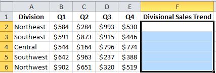
Highlight cells F2:F6 where we want our Sparklines to appear.
Next, click the Insert tab and select the type of Excel Sparkline you want to use. In the original example I chose a line chart, but you could also choose column or Win/Loss depending on what makes the most sense for the data you are working with.

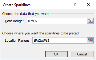
The dialog box that opens will ask you to fill in what data the Excel Sparklines should use. Since we already highlighted cells F2:F6, the dialog box is smart enough to fill in the Location Range for us with $F$2:$F$6, which is what we want it to do. Note: It will fill in whatever the active cell(s) on your worksheet in the Location Range if it detects that the cells are blank. It will fill in the Data Range with the active cell(s) if it detects that those cells that contain data.
You will need to tell it what data to use now in the Data Range box. Simply click in that box and highlight cells B2:E6 with your mouse and it will populate the cells in that box for you. You can also manually type the cells if you wish. Click OK when you’re done.
This will give you Sparklines in cells F2:F6 that represent the data in columns B:E for each individual row.
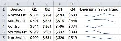
Ah, but I don’t like how that looks. I prefer it if there are points on the line to make the values stand out a bit more than this. Luckily we can customize how the Excel Sparklines look. To customize it, simply click anywhere in the set of Sparklines and you will notice a Design tab show up. Clicking on that tab will allow us to change the style of our Excel Sparklines, what data is shown, and how to highlight the important data like high or low points, individual data markers, negative points, etc.

To get the markers to show up like I want them to, I can click the Markers checkbox in the Show group. Clicking Markers will get me something like this.
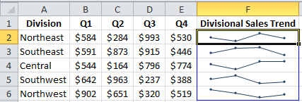
I’m still not happy though. I want the markers to be a different color than the lines. Luckily we can use the Marker Color option in the Style group to change the markers to the dark red color I had in the original example. You can also use this menu to change the color of your negative points, high point, low point, first point, and last point. If you need to change the sparkline color, you can simply click the Sparkline Color menu from the Style group and change the color and the weight of the line that’s used.
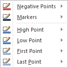
Now, because we highlighted cells F2:F6 when we first set up our Sparklines, any style changes we make will be applied to all five of the Sparklines. This is great if we don’t want to spend time formatting each exactly the same, but what if we wanted each line to be formatted differently? Maybe you recognize divisions in your company by color and want the divisions to have the correct coloring.
If you click the Ungroup button at the far right side of the Design tab, it will allow you to make style changes to each individual Sparkline on your worksheet. You will need to click on the Sparkline you want to edit first and then make the appropriate changes.