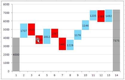
Water fall chart shows the cumulative effect of a quantity over time. It shows the addition and subtraction in a basic value over period of time and the final effect of these transactions. In Excel 2016, the chart is available by default and can be easily added through Insert>Chart>Other Charts>Waterfall.
In today’s post, we will learn how to produce similar chart in Excel 2007 / 2010.
The Dummy Data:
So we will start with some dummy data…
Here the value 4000 is the starting or the base value and is followed by increments and decrements – 1707, -1425, So on. The cumulative effect of the transaction is obtained by summing all the transactions and is found to be 7357.
![]()
Setting up Table:
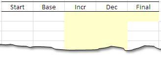
Most of the time, we want to avoid the manual work – in order to do so, we need to create a table with few formulas to automate the process. Firstly we will setup a table to hold the data. The columns will hold the respective values from the data, but the base value and the final value will be calculated by using a formula.

The formula:
We need to use two formulas- the first one to get the base value and the other one to get the final value.
The first formula works by checking if there is any increment in the increment column. This is done by the logical check D6>0. If TRUE, the value in the Final Column is returned, otherwise the difference of Final value and the decrement is returned – the case of a decrement. The formula once dragged down will give use the Base Column.

The second formula is used to calculate the Final value in the Column F. The final value is calculated by adding up the increment and subtracting the decrements.
The Manually entered values:
The manually entered values are highlighted by yellow cell fill. This is a convention followed in most of the excel sheets that input cells are marked light yellow fill.
Plotting the graph:
Once you are done with the table, we need to plot the graph. Go to Insert Columns>Stacked Columns and insert the chart. It is important to observe that we will plot all three values in each stack bar – i.e. base, Increment and Decrement but for increments, decrements will be zero and vise versa.
 Select the respective range and plot the values.
Once done, you will have the basic chart for further modification.

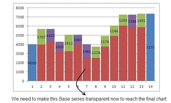
For the basic chart obtained, we need to place the data labels – but for values only that are non zeros, we need to remove the horizontal lines, and make the Base series transparent to give the effect of increase and decrease.
Formtting Chart:
Inserting Data Labels: select the respective series and right click > Select Add Data Labels. Repeat this for all series.
Hiding Zeros in the Data Labels: when you will put data labels, Zeros will also be displayed making chart look unprofessional. For handle this problem select Data Labels>Format Data Labels>Number>Customer Format Number and put this format: 0;;;@, will hide the unnecessary zeros from the chart
Remove Horizontal Lines: Select and delete the horizontal lines.
Adjust the width of the Bars: Select any series Right Click>Format Data Series>Gap Width set to 10%
Delete Series Key on right side: select and delete the series key on the right.
The chart now should look like:

Making Base Series Transparent: Select the series Right Click>Format Data Series>Fill>No Fill. This will make the series Transparent.
Make the remaining series partly transparent: In order to make the data labels more readable – Select every series Right click Select Series>Format Data Series>Fill>Solid fill>Transparency to 50%.
With all these modifications – the final chart should look like:

Though this is not entirely automated solution to the problem – it gives a sought of template to work with. Please download the sample file for this link.