Most Excel users know how to create either a bar chart or a line chart to visually show a set of data. One way to really step up your game and graphically show multiple relationships across two or more sets of data is to use a combination chart. This powerful function will allow you to combine a bar chart and a line graph and add a Y-axis (vertical line) to express broader data linkages and drive insight that might not be apparent otherwise.
For the sake of this post, we will plot two different quantities of data into a combination chart expressed with bars and a line graph and also show you a lesser-known trick allowing you to graph the data logarithmically, which can sometimes yield surprising insight.
Reasons for using combination charts:
A combination chart could be used for variety of reasons, for example:
- When you have more data to plot and want to differentiate one quantity from the other
- When the values from one series is too large or small compared to the other data
So let’s see how can we create a combination chart and make it more meaningful and professional.
Our Data:
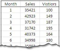
We have created a set of sample data that we will be using throughout this post. It is evident that sales volume is far more than the number of visitors in this table:

First Step – Creating the bar chart
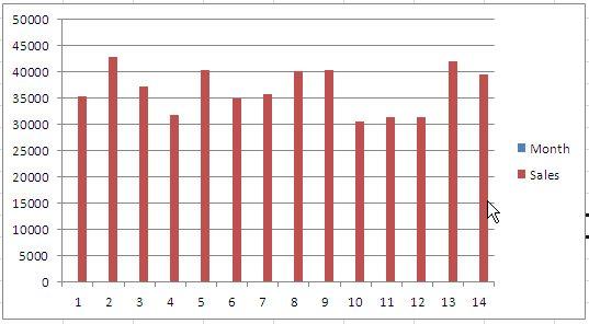
Starting with Sales we will create a simple bar chart to plot the data. To insert a Bar Chart go to Insert > Bar Chart while the range B2:C16 is already selected. (Or the range already selected press Alt>N>C>Enter to insert the chart. A basic and standard formatted bar chart will be displayed as a result.
Second Step – Adding No. of Visitors
Now that we want to create a combination chart, we will be adding another series to this chart – No. of visitors.
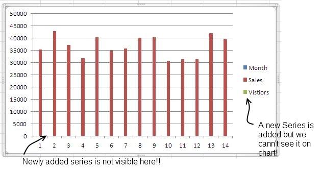
For that: Right Click chart>Select Data>Add New Series and now insert the Series Name and select the range D3:D16.

When pressed Ok, the chart will be updated. We have a new series added to the chart but we can’t see it practically on the cart – the values are too small to be visible on chart.

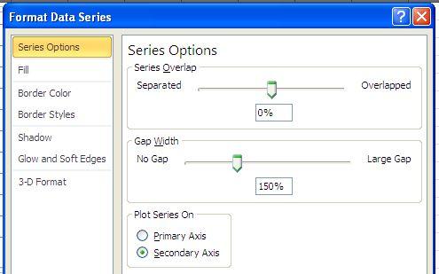
What we need to do is to plot it on secondary Y-Axis to get a scale that is appropriate to display the variable. Since the series is not easily visible on chart, we will be selecting it from Format menu, select available features that can be formatted and finally select Series “Visitors” and press Format Selection to format it.

Once selected we need to plot it on secondary axis.

With this data plotted on secondary axis, select the series (that is now easily visible and change the chart type to line:

Improving the appearance of the chart:
For the modified chart, we have:
- Removed the data series “Month” that was plotted to have more space in between bars.
- Muted the color tone of horizontal grid lines, so that we can focus on data rather then grid lines.
- Muted the overall tone of the chart – used light colors instead of shocking red.
- Markers in green turned to round and gray in the new chart.
- Added a title to the chart.
That was it – we now have our new combination chart!
Yet another option to plot the data – using LN() to plot log values:
What we considered in the preceding lines was a data from a business report, if we have been using “scientific data” and our audience has that mathematics background, we can plot the log values instead of actual values for sales volume and No. of visitors using the function LN():

We can see that though we have not used any secondary axis, the values are visible and we can see a trend in them as well – but this should be done keeping in view the understandability of the target audience.
This is all for this post, please downloads the sample file for practice.