Introduction:
Excel has wealth of options to perform Trend Analysis. Trend Analysis is a very useful tool for business decision making and is a widely adopted procedure in Sales, Marketing, Finance, Operations and Inventory control. In today’s post, we will learn about options available to us to find the trend in our data and our focus will be mainly on quantities techniques.
04 Methods that can be used for trend analysis:
We can use the following methods to analyses the trend in our data:
- Graphical Plotting
- Using Averages (or implementing moving averages)
- Using Trend and Forecast Function
- Analyzing data by running regression analysis:
For this tutorial we will be using following data set:
- Sales of Cars in Quebec from 1960-1968 (Download)
Performing Visual Inspection – Plotting a Graph:
Perhaps, the first step in analyzing the data is to plot it! For this case, we will consider the time series data for the sales of cars. The data consists of car sales for Quebec from year 1960 to 1968, with data for each month sales. Thus this data consists of 72 data points, representing each month.
We will plot the data by going to the Tab Insert then Charts and Insert the Line Chart (or Press Alt + N + N + Enter) to insert the chart.
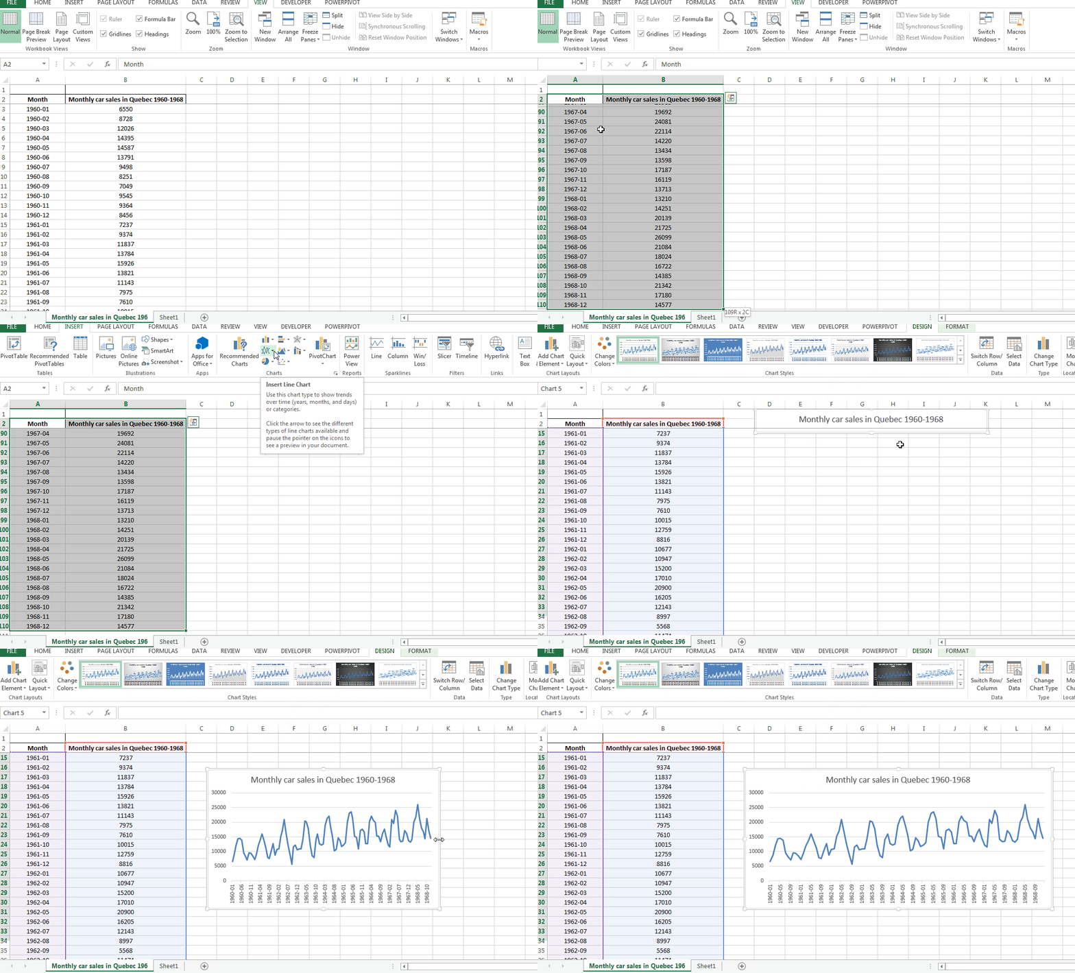
The figure shows a clear trend – the data is cyclic and with an increasing trend! A cyclic trend shows seasonality in shorter term, whereas increasing trend shows improvement in overall demand of car sales that is good news for car manufacturers.
Moving Averages:
Moving averages comes to rescue when we want to give a more robust quantitative basis to our decision making. The moving averages relies on the past data and the result provided can be quite realistic.
Let’s plot the data for car sales once again, and add the moving average element to it so that we can compare the two. We will setup a table like following:
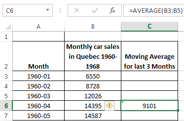
As we will double click the green box on the lower right side of the current cell, the formula will be filled down the column. The result will be a series of averaged values against the actual sales value. Once plotted, we can plot the line chart to give the following result:
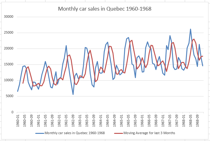
The blue line represents the original data, while the moving average is shown by the maroon line. We can observe a “lag” in the forecasted value. This is one of the main draw backs of using moving averages, but we can also see that the moving average has accounted for the seasonality as well as trend in the data.
Using Forecast & Trend functions in excel:
Excel has a built in function to do forecasting, that is FORECAST () function. In order to use forecast function, we will be using the Second Data Sheet with values from a scientific experiment. The table we will be using looks like the following:
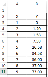
We can use the following syntax of the FORECAST function:
FORECAST(x, known_x’s, known_y’s)
We need to go to the formula bar, and enter the above formula, with following arguments:
- X is the value we will be making forecast for.
- known_x’s are known values of x and
- known_y’s are the known values of y against respective values of x.
As we press enter, the formula gives forecast for the given value of x.
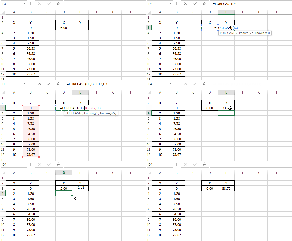
Note that before we plot, we can always have option to plot the data to examine the trend. A similar forecast can be made using the excel’s TREND() function that takes similar arguments:
TREND(known_y’s, known_x’s,x,[constant])
The result will be similar to what we achieved through Forecast function:

Analyzing data with regression analysis:
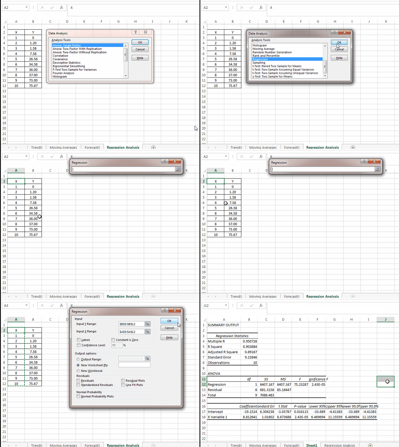
The last tool we will be discussing is Regression Analysis. In order to run Regression analysis, we need to enable analysis tool pack in excel. This is done by going to options>Addins>go >Analysis Tool pack. Once enabled, we will be able to see the option in Data Tab. On clicking Data Analysis we will have the following menu -As we select the regression analysis option, we will further be shown the following dialogue box that we will use to refer to ranges and will provide you analysis.
In the following output, we have these terms that we can use immediately:
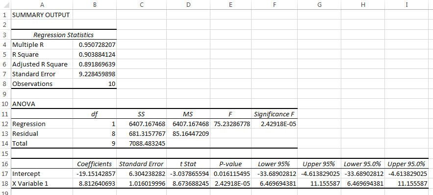
R-square and Adjusted R-Square: Explaining how well the model is explained with this data. we can see that our data is 95% and 90% explained which is a good thing. The Intercept and the X-Variable also explains the form of the equation that comes out to be :
Y= 8.8 X -19.15
We can use this equation to plot the data manually.
Conclusion:
We have observed three methods for trend analysis. The first one was pretty basic that relied on graphical presentation of data. The second one uses past data and averaged it out. The third one uses the formal regression analysis procedure provided in data analysis tool pack of excel and is a standard procedure to assess trend and relationship. You can download the sample file from this link.