Introduction:
The data analysts start their analysis by visual examination of the data. This is to see if there are any patterns present or if there is any (apparent) relationship between variables. The data such plotted produced graphs of various types – an Excel Histogram is just one of them.
In today’s tutorial, we will learn a little but of theory about histogram, how to read it, few statistical terms and finally, how to plot a histogram using MS Excel.
The “Concise Oxford Dictionary of Mathematics” defines Histogram as:
“A diagram representing the frequency distribution of data grouped by means of class intervals. It consists of a sequence of rectangles, each of which has as its base one of the class intervals and is of a height taken so that the area is proportional to the frequency. If the class intervals are of equal lengths, then the heights of the rectangles are proportional to the frequencies.”
In this definition (and for the discrete data sets) the “frequency distribution” is the frequency of how often a number is repeated in a data set. The term “class interval ” represents the grouping of data in n-groups where n can be an arbitrary value.
The Nomenclature of a Histogram:
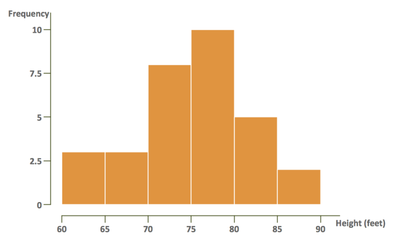
There are some features that can be found in every histogram. The following picture shows various parts of it!

The above figure is overall a histogram. In this histogram:
- The yellow bars represent the frequency of items. For the fixed interval class, the height is proportional to the frequency of the items.
- The X-Axis has “Intervals” or it represents the class width for which the frequency is reported. In above example class 60-65 has frequency of 25.
- The Y-Axis represents the frequency axis.
Taking a sample data and working out Histogram:
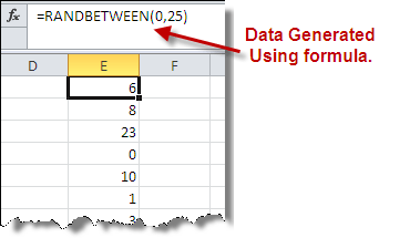
If you have a data set for creating histogram that is great. If not, you can make one using excel function RANDBETWEEN(). This function can give you randomly generated numbers between an lower and an upper bounds and you can analyze it with histogram.
Let’s take an example of data generated between zero and 25 as shown in the following picture:

Generate data and keep only values (NO formula):
In order to make a histogram, the first step is to get rid of this RANDBETWEEN() formula when we have our data. To make this data static, copy the entire column and Paste Special as Value only. This will remove the formula but will keep the values and make data stationary.
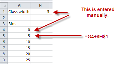
Define “Class Width” and create a table for “Bins”:
Let’s assume the class width be 5 – this means data will be grouped in groups of 05 each. The bin represents interval by itself.

Use Data Analysis Tool Pack to Create a Histogram:
Excel’s data analysis tool pack is the easiest way to generate Histogram. To access the feature your first need to load the add-in from File>Options>Add-Ins>Manage Add-ins>Analysis Tool Pack. This will cause Data Analysis tool pack to be displayed in the data menu.

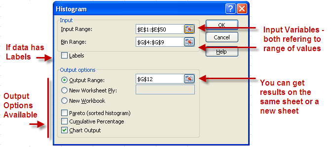
When you will choose data analysis tool pack, it will show you variety of options, you have to select Histogram. In the Histogram dialogue box, you need to enter the range referring to the data and the data bins.

After doing with the input range and the output options, you can press OK and a histogram will be produced like on shown below:

The table on the right is bin-wise frequency of the data and the same is shown through a bar chart on the right.
Adding More Options:
Let’s try tick all the options available in the lower left side of the dialogue box and see what is the result:
The first two columns in the table are the same as were in the last case. The third column reporting the cumulative % is calculated by dividing the running sum with the total values in the data set. (In our case it is 50 so 2/50=4.00%, (2+7)/50=18% and so on).
In the second part of the table the bins are sorted according to the highest frequency. Thus the bin with the highest one comes first (25 with count of 13) followed by 15 (count of 11) and so on and then the last column reports the percentage with running sum as we have calculated previously.
The chart shown on the left is a “prioritized histogram” – a type of histogram that shows the factors taking into account the effect or weight. So in this histogram the bin 25 has the highest effect (with highest frequency) and so on. The red line in the chart shows the cumulative effect and we can see that in light of 80/20 rule, the most important section of the data belongs to the first and the second bar i.e. data from Bin 25 and 15.
Conclusion:
We can still explore this histogram by choosing lesser options to see if the “skewness” and “kurtosis” of the data visually. Please download the sample for this tutorial to see how the things actually work.