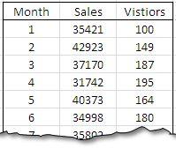
Most Excel users know how to create either a bar chart or a line chart to visually show a set of data. One way to really step up your game and graphically show multiple relationships across two or more sets of data is to use a combination chart. This powerful function will allow you to combine a bar chart and a line graph and add a Y-axis (vertical line) to express broader … [Read more...]
Use Silk to convert your Excel Files into an interactive online database with visualizations
Do you have an Excel file with information that you would like to publish on the Internet or share with co-workers? Maybe addresses you want to put into a map? A directory of partners and contacts? Or just a gallery of your favorite restaurants? For free? Then you might like Silk. Silk is a data publishing platform that lets you convert a spreadsheet into a live interactive … [Read more...]
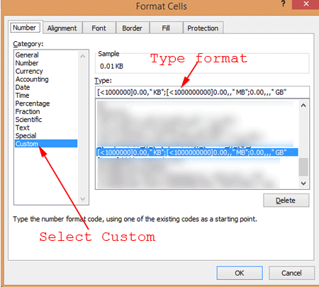
How to Format Numbers as File Sizes
Have you ever had a list of files with accompanying file sizes that you wanted to use in some sort of calculation such as adding up the file sizes, averaging them, using them in some sort of chart or other calculation? The way we usually read file sizes is with the appropriate size abbreviation such as B (bytes), KB (kilobytes), MB (megabytes), etc. However, this makes it … [Read more...]
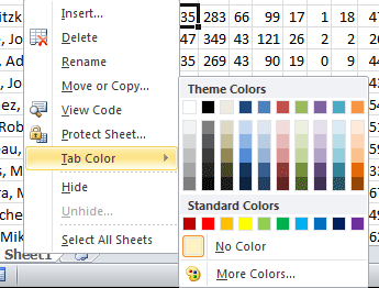
10 Excel Tips For Increased Productivity
Microsoft Excel has tons of uses available to its users. But not everyone knows all the features that Excel has to offer. Some Excel tips will help you instantly become more productive, or use Excel more efficiently. Click through to see our top 10 Excel tips. … [Read more...]
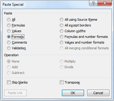
7 Excel Formatting Tricks
Microsoft Excel, like any other Office product offers it's users simple and intuitive ways to format your data. Many of these formatting options are great for using once or twice, but what if you find yourself needing the same format dozens of times, or need a format that doesn't exist? The following Excel formatting tricks will help you work more efficiently. … [Read more...]


